
In today’s fast-changing digital world, having a strong online presence is key. With most people using smartphones to access the web, it’s vital for businesses to make sure their websites work well on all devices. This is where responsive web design comes in, making sure websites look good and work smoothly on any device.
Studies show that people make up their minds about a website in just 0.05 seconds. Also, search engines like Google now favor websites that work well on mobiles when ranking them. So, making your website responsive is a must for growing your online business.
A responsive website can boost mobile sales by 67% and increase customer conversion by 22%, as Google and HubSpot found. It also helps search engines index your site better, reducing problems with duplicate content. Forrester Research says investing in responsive design can give you an ROI of up to 100%.
By focusing on responsive design, businesses meet customer needs and stay ahead in the digital market. It’s a smart move for any online business looking to grow and succeed.
What is Responsive Web Design?
Responsive Web Design (RWD) is a new way to make websites. It makes sure a mobile-friendly website works well on all devices and screen sizes. Ethan Marcotte introduced this idea in 2010. It uses fluid grids, images, and media queries for the best viewing experience.
Definition and Key Concepts
RWD uses fluid grids that grow or shrink to fit any screen. It uses media queries to apply CSS rules based on screen size. This makes a website truly adaptive web design. Adding responsive images and media makes content adjust to each device, improving the user experience.
Importance in Today’s Digital Landscape
About 52% of all online traffic comes from mobile devices. Making websites mobile-friendly is very important. A user-friendly interface is key as more people use mobiles.
Studies show that 74% of users come back to mobile-friendly sites. But, 61% won’t return to sites that are hard to use. Responsive design shows a business cares and is professional. So, making RWD a priority is vital for success online.
Benefits of Responsive Web Design
Responsive web design brings many benefits to modern websites. It’s key for staying competitive.
Improved User Experience
Responsive websites make browsing easy on all devices. This keeps visitors longer and lowers bounce rates. They also load 50% faster on mobiles, making the experience better.
By using responsive design, bounce rates can drop by up to 30%. This means more customers stay with you.
Increased Mobile Traffic
Over 50% of internet users are on mobiles. Responsive design is vital for reaching them. Mobile users are 48% more likely to visit a site that works well on phones.
Also, 60% of web traffic comes from mobiles. This shows how important responsive design is. Businesses see a 67% rise in conversions with it, showing better engagement with mobile users.
Higher Search Engine Rankings
Google values mobile-friendliness in its rankings. Sites without responsive design might lose out on revenue and audience. Mobile-friendly sites see an average rank boost of 11.8 positions.
This SEO boost means more traffic and visibility. Companies that switch to responsive design see big jumps in traffic and engagement.
Key Features of Responsive Web Design
Responsive web design is key for businesses wanting to improve user experience on different devices. With 94% of users not trusting websites with bad design, features like fluid design and dynamic resizing are vital. Over 70% of businesses now use responsive design to make their sites work well on mobiles, helping keep users interested.
Fluid Grid Layouts
Fluid grid layouts are at the heart of responsive web design. They let web page elements resize based on screen size without losing quality. About 62% of companies using fluid grids saw a 20% drop in bounce rates, showing better user engagement. This design makes websites look good on all devices, improving user experience.
Flexible Images and Media
Flexible images and media are key for responsive design, making sure visuals fit all screen sizes. This feature boosts looks and speeds up loading times on all devices. Sites with responsive designs see up to a 50% increase in mobile traffic and engagement. Responsive images can also make mobile loading times up to 40% faster.
CSS Media Queries
CSS media queries, or breakpoints, are vital for responsive web design. They let webpages change styles based on device size and orientation. Using media queries can make mobile response times 30% faster, improving user experience. With mobiles making up over 54% of web traffic, ensuring sites work well on them is critical.
The Role of Mobile Users in Web Design
Mobile internet use has grown a lot, making it key to design for mobile users first. Google now suggests using a mobile-first design. This approach makes sure mobile users have a great experience, which helps with search rankings and keeps users engaged.
Growth of Mobile Internet Usage
More than half of all web traffic comes from mobile devices. This makes mobile user engagement very important in web design. Websites that focus on mobile users often get more visitors.
Responsive web design makes sure sites work well on mobiles. This is important for Google’s rankings, helping sites show up better in searches.
Understanding Mobile User Behavior
It’s important to know how mobile users behave, like how they scroll and tap. Designing for mobile should be user-focused, making sure it’s easy and accessible. A good mobile experience keeps users on the site longer and encourages them to take action.
Best Practices for Implementing Responsive Web Design
Creating a responsive website is all about making it work well on all devices. It’s important to focus on a few key areas to ensure a great user experience. This way, websites can meet the needs of mobile users and perform better overall.
Prioritize Content Hierarchy
It’s vital to organize your content in a clear and logical way. This makes sure that key information is easy to find and see. It also makes managing your site’s content easier and more efficient.
Test Across Multiple Devices
It’s important for your website to work well on all devices. Testing on different devices helps find and fix any issues. With 54.85% of web traffic coming from mobiles, making sure your site works on all screens is key.
Optimize for Load Speed
Fast load times are essential for keeping users interested and improving your site’s ranking. Responsive design can make your site load faster by reducing server requests. Faster sites also help everyone access your site more easily, making it more inclusive.
Responsive web design is not just a trend; it’s a must. By managing your content well, testing on various devices, and focusing on speed, you can make your site more user-friendly and search engine-friendly. These practices help create a strong online presence that appeals to today’s tech-savvy users.
Common Mistakes to Avoid
Making a strong first impression with your website is key. 94% of users judge a site by its design (Loopex Digital). Here are some common mistakes that can harm your site’s look, ease of use, and mobile friendliness.
Ignoring Mobile Optimization
Now, 61.2% of all website traffic comes from mobile devices. Google values mobile-friendliness in rankings. So, ignoring this can hurt your site’s visibility and traffic.
Also, 50% of users will leave if your site isn’t mobile-friendly. Making your site mobile-friendly can boost engagement and lower bounce rates. Users are more likely to stay and interact with a site that works well on mobile.
Overloading Pages with Content
Another mistake is loading pages too much with content. This messes up your site’s design and can confuse visitors. Research shows 40% of users will leave if a site takes more than three seconds to load.
Keeping your site fast and easy to navigate improves user experience. Sites that load in 2 seconds or less have a 9% bounce rate. But sites taking 5 seconds have a 38% bounce rate. Keeping content simple and organized helps keep users, lowers bounce rates, and boosts SEO.
Tools and Technologies for Responsive Web Design
In today’s fast-changing digital world, using the right tools and technologies is key for responsive web design. The right web development frameworks and design software make creating websites for different devices easier. Here, we look at some top frameworks and design tools for making responsive web solutions.
Frameworks to Consider
Frameworks like Bootstrap and Foundation are vital for making responsive websites. Bootstrap, an open-source tool, has pre-made components and a strong grid system. This makes it easy to make layouts that work on all devices. Foundation also has a mobile-first approach, ensuring websites are responsive from the start.
TailwindCSS is another important framework. It uses a utility-first method, making it easy to style HTML quickly. PureCSS and Skeleton are also great for fast, simple responsive projects because they are lightweight and easy to use.
Design Tools and Software
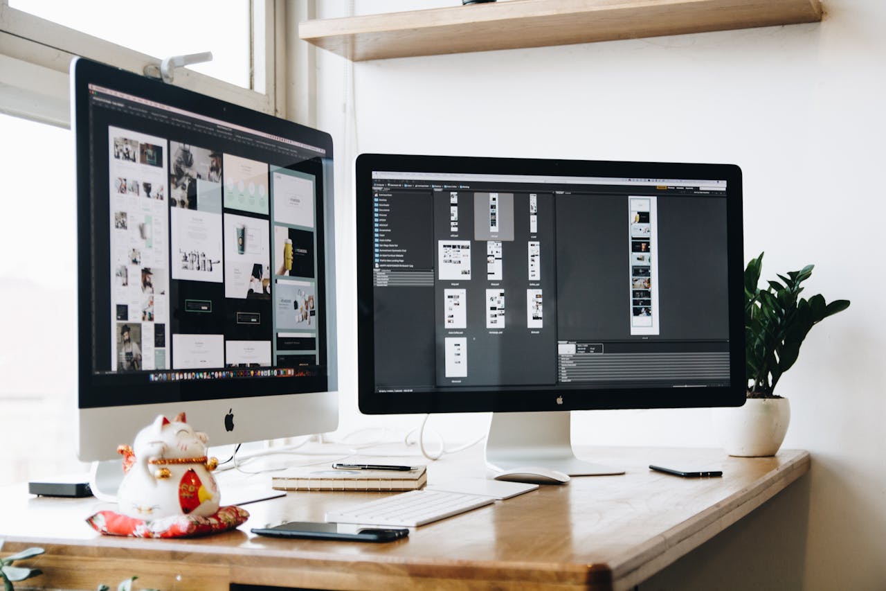
Design software is essential for making websites that look good and work well. Adobe XD, Sketch, and Figma are top tools for this. Adobe XD is a complete UI/UX solution for designing responsive layouts. Sketch is known for its vector editing, perfect for web design.
Figma stands out for its real-time collaboration features. It lets designers and developers work together smoothly on responsive design projects. Elementor is also popular for its customization options and responsive editing modes, making it easy to design for different devices.
By using these advanced tools, developers and designers can make websites that work well on all devices. This not only makes the website better for users but also helps it rank higher in search engines. This leads to more engagement and sales.
Responsive Design vs. Adaptive Design
In today’s digital world, companies face a choice between responsive and adaptive design for their websites. Both offer ways to adapt to different screen sizes. Knowing their differences helps in making the right choice.
Key Differences Explained
Responsive design uses one fluid layout that changes with screen size through CSS media queries. It’s easy to maintain but might slow down if not optimized. On the other hand, adaptive design has multiple fixed layouts for six screen widths.
These layouts can make websites load faster and offer better experiences, like Amazon’s e-commerce pages or USA Today’s user experiences.
Choosing the Right Approach
Choosing between responsive and adaptive design depends on your needs and resources. Most businesses prefer responsive design for its simplicity and SEO benefits. Google’s Mobile-Friendly Update in 2015 supports this choice.
Responsive design also helps with search engine rankings by having one URL for each page. Adaptive design, though more work, gives more control over each layout, improving user experience, as seen with IHG’s booking process.
Responsive design is about 30% cheaper than adaptive design, making it a budget-friendly option. But, big companies with complex sites might prefer adaptive design’s detailed control. For more on these strategies and how they can enhance your online presence, check out our page on responsive web design services.
The Importance of SEO in Responsive Web Design
SEO is key to the success of responsive web design. Google now focuses more on mobile-friendliness. This section explores mobile-first indexing and the importance of fast-loading pages for SEO.
Mobile-First Indexing
More than 60% of web traffic comes from mobile users. Google now ranks mobile sites first. It’s important to follow SEO best practices for your mobile site.
Responsive web design makes it easier. It offers a smooth experience on all devices. This helps search engines crawl and index your content better.
Page Load Speed and SEO
Page load speed is a big factor in search engine rankings. If a site takes over 3 seconds to load, 53% of users leave. Fast-loading pages improve user experience and SEO.
Responsive design helps with this. It makes sure your site loads quickly on all devices. This leads to better user satisfaction and higher search rankings.
How to Measure the Success of Responsive Web Design
Measuring the success of your responsive web design is key. It helps make better decisions and improves how users feel. Using the right tools and metrics gives you important insights.
Analytics Tools to Use
Start with strong analytics tools. Google Analytics tracks user engagement on different devices. BrowserStack, used by big names, tests on over 2000 browser and device combos.
Google’s Mobile-Friendly Test checks if your site works well on mobiles. This shows how vital mobile optimization is.
Key Performance Indicators
It’s important to know your KPIs. Look at user engagement by checking bounce rates and pages per session. Also, track how well your marketing does, aiming for a 5% conversion rate on product pages.
Fast load times are key; they help keep users and boost SEO. Try to cut bounce rates by 10% and increase blog traffic by 20% in a quarter. Use surveys and recordings to get feedback and improve user experience.
Keep checking these metrics to make your design better. This ensures a smooth experience on all devices. It’s what 83% of mobile users want.
Case Studies: Successful Responsive Web Design
Looking at successful responsive web design shows us how big brands stay ahead. They make smart choices and find new ways to keep up. This part talks about companies that did great with their website redesigns and what we can learn from them.
Notable Examples
The BBC is a top example. Their website got 10 million more visitors each month after they made it responsive. Another big win is Alibaba. They saw a 76% rise in website traffic and over 30% more mobile sales. These stories show how important it is to have a website that works well on all devices.
Lessons Learned from the Best
These examples teach us a few important things. First, using new design ideas is key. Things like fluid grids and flexible images make websites look good and work well on any device. Second, knowing what users like is essential. Use tools to see how people interact with your site and make it better for them.
Lastly, testing on different devices is a must. The BBC and Alibaba worked hard to make sure their sites worked well on all screens. This makes users happy and helps your site rank better on search engines.
By learning from these examples, businesses can improve how users interact with their sites. This leads to better performance and more success online.
Future Trends in Responsive Web Design
Web design is changing fast, with AR and VR integration and voice-activated interfaces leading the way. These new tools are making websites more interactive and easy to use. They are part of the future of web design.
The Rise of AR and VR
Augmented Reality (AR) and Virtual Reality (VR) are changing how we use the internet. By 2023, mobile devices will make up over 54% of all web traffic. This means web designers need to add AR and VR integration to their sites.
AR can make online shopping more fun. It lets users see how products look in their own space before buying. Sites with AR and VR see about a 30% boost in user engagement. This is great for keeping users interested and increasing sales.
Voice Search Optimization
Voice-activated devices like Amazon Echo and Google Home are everywhere. So, making websites work well with voice-activated interfaces is key. Today, 20% of Google searches are done on mobile devices, and many are voice searches.
Web sites that focus on voice search do better in search results. Adding voice-friendly features to futuristic web design makes sites easier to use. A study shows 85% of web teams now focus on responsive design for voice search. This shows a big shift towards more interactive and user-friendly web sites.
The Cost of Responsive Web Design
The cost of responsive web design can change a lot. It depends on several important factors. Knowing these factors and planning your budget well are key to finding affordable solutions that fit your financial goals.
Factors Affecting Costs
Many things affect the cost of responsive web design. The site’s complexity, how much customization you need, and the technology used are all important. Basic designs usually cost between $6,500 and $15,000. More complex designs can cost between $50,000 and $100,000.
Other costs include writing website content, which can be $60 to $300 per page. Designing the style can cost between $2,000 and $15,000. Small businesses might spend $2,000 to $5,000, while bigger projects can cost up to $15,000.
Budgeting for a Responsive Redesign
Good financial planning is key for a successful web design project. Businesses usually spend 6% to 20% of their marketing budget on web design. Costs can vary a lot; 53% of businesses spend between $501 and $5,000 a year. Most businesses, 84%, are happy with the return on investment from their web design.
Annual costs can range from $501 to $1,000 with agencies and $1,001 to $5,000 with freelancers. It’s important to have enough money for the initial design and ongoing maintenance. This ensures your site stays functional and user-friendly.
In summary, finding an affordable web design solution requires careful budgeting and understanding the costs. By aligning your spending with your business goals and planning well, you can see a big return on investment. This can help your business grow and have a strong online presence.
Hiring a Responsive Web Design Professional
When you’re looking for designers for responsive web design, it’s key to check their qualifications. They should have at least 3 years of experience. This means they know how to make websites work well on all devices and browsers.
Finding the right person involves using good interview questions. These questions help figure out if they can solve problems and do their job well.
What to Look For
Good candidates should have a portfolio that shows their work on responsive designs. They should know HTML, CSS, and JavaScript. These are important for making websites today.
It’s also good if they know how to use WordPress or other CMS tools. This shows they meet industry standards. Make sure to be clear about what you expect from them and how long the project will take.
Questions to Ask Candidates
Ask questions that show how they think about design. For example, ask how they make websites better for users and how they improve mobile experiences. Remember, most web traffic comes from mobiles.
Also, ask about their plans to make websites faster and more engaging. They should know how to use SEO to help websites rank better. It’s important to see if they can work well with others, as team effort is key in web design projects.
Conclusion: Investing in Responsive Web Design
Responsive web design is a smart choice that brings many benefits. It makes your website work well on all devices. Big names like Airbnb and Dropbox have shown how it works.
They made their sites easy to use on phones and computers. This is key because most people now use their phones to surf the web. By making your site responsive, you can keep more visitors, make your site easier to use, and save money on updates.
Also, it helps your site show up better in search results. This means more people will find you online.
Long-Term Benefits
Responsive web design has many advantages. It makes your site load faster, which is great for phone users. Plus, Google likes responsive sites, which can help you rank higher in search results.
A good responsive site also helps you keep visitors interested. It makes them want to stay and explore more. This can lead to more sales and growth for your business.
Getting Started with Your Project
Starting a responsive web design project needs careful planning. First, you need to know what you want to achieve and who your audience is. Then, pick the right tools and frameworks to make your site work well on all devices.
Working with experienced designers is also key. They can help bring your ideas to life. By focusing on these basics, you can make your investment pay off and grow your business in the long run.
Contact Us
We make it easy to get in touch with us through WhatsApp. This way, we can help you fast and effectively. You’ll get quick answers to your questions, making your experience better.
Direct Contact via WhatsApp
In today’s world, quick communication is key. That’s why we offer WhatsApp contact. It’s a simple way to talk to us about your web design projects.
+201226143803
Save our WhatsApp number, +201226143803, for easy access. We’re here to help you whenever you need it. Your happiness is our goal, and we’re ready to support you promptly.