
The world is moving fast to mobile-first internet use. Sites not optimized for mobile are becoming outdated. About 58% of internet traffic comes from mobile devices.
A mobile-friendly website is easy to use on smartphones and tablets. It has buttons and links that are easy to tap. Making your site mobile-friendly is key for keeping users, improving search rankings, and boosting traffic.
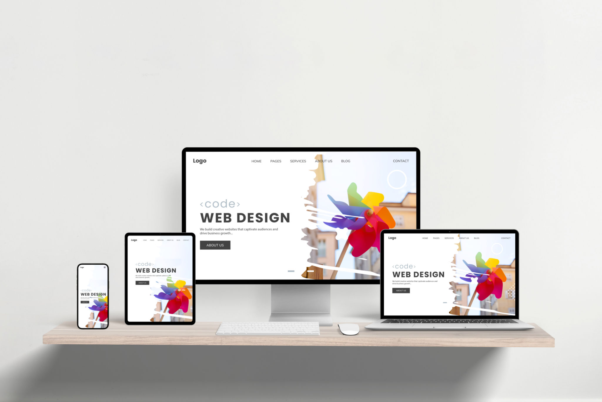
Using a responsive layout that works on any device is essential. This ensures your content is easy to read and navigate, no matter the device.
Statista predicts mobile phone users will hit 7.7 billion by 2028. Fast loading times and responsive design are critical. Google favors mobile-friendly sites for better SEO.
Slow sites can lose 7% in conversion rates for every 1-second delay. Speed is not just important; it’s a competitive advantage. About 47% of visitors leave if a site takes over 2 seconds to load.
Mobile-first design is key in today’s digital world. It focuses on the mobile user experience from the start. This means touch navigation, adaptable screen sizes, and quick access are essential.
User experience principles guide us to use the viewport meta tag and declutter designs. This makes sites easier to use.
Testing sites on real mobile devices is vital for a good user experience. It’s important to test on different browsers and devices. This ensures your design works well everywhere.
Image compression tools also help improve loading times. A strong mobile design meets user needs and keeps you competitive in a mobile world.
Importance of Mobile-Friendly Website Design
In today’s world, having a mobile-friendly website is key. About 60% of all internet traffic comes from mobile devices. This means your site must work well on phones to keep users happy and engaged.
Companies with easy-to-use websites see better results. They get more customers and keep them coming back.
User Experience and Engagement
Good mobile design makes for a better user experience. People like sites that are easy to use and navigate. If your site doesn’t meet these standards, users might leave quickly.
Things like big enough text and easy-to-click buttons are important. They help keep users interested and on your site longer.
Impact on SEO Rankings
SEO-friendly design is vital for your site’s ranking. Google now favors mobile-friendly sites more than ever. This means your mobile site is more important than your desktop site.
Fast-loading sites also do better. Sites that load in one second can have three times the conversions of slower sites.
Increasing Mobile Traffic Trends
More and more people are using mobile devices to surf the web. In fact, mobile traffic makes up over 54% of global web traffic. This number keeps going up, so businesses need to adapt.
Improving your site’s mobile performance is key. This includes optimizing images and testing on different devices. Doing these things can make your site more engaging and keep users coming back.
By focusing on these areas, you can improve your site’s user experience. This also helps with SEO-friendly web design. It’s a step towards lasting success online.
Essential Features of Mobile-Friendly Websites
In today’s world, having a mobile-friendly website is key. Mobile web visits now beat desktop visits by more than three times. A good mobile site needs responsive design, fast loading, and easy navigation. These features boost mobile optimization and website responsiveness.
Responsive Design Principles
Responsive design ensures a smooth experience on all devices. It adjusts the site layout based on the screen size. This makes maintenance easier and keeps the site responsive. A responsive site can make users stay longer by 50%, as they enjoy a consistent experience.
Also, make sure call-to-action buttons are big and easy to see. Use high-contrast colors to make them stand out on small screens.
Fast Loading Times
Speed is vital for mobile users. They’re 53% more likely to leave if a site takes over three seconds to load. Google says content should load in under one second for the best experience. Sites that do this are 2.5 times more likely to convert visitors.
Optimizing images can cut loading times by up to 80%. This boosts user engagement and satisfaction. Fast-loading sites keep users and rank better in search results.
Intuitive Navigation
Simplified navigation is key for mobile sites. Many desktop sites have complex menus that don’t work well on mobile. Use hamburger menus to save space and make navigation easier.
Navigation on mobile should focus on user experience. Make sure touch targets are at least 48 pixels to avoid accidental clicks. Using white space can improve user understanding by 25%, making browsing more enjoyable.
By focusing on these features, you’ll boost user satisfaction. This will also improve your website’s responsiveness and mobile optimization. You’ll see more traffic and conversions.
Tools to Test Mobile-Friendliness
It’s key to make sure your website works well on mobile devices. There are many tools to help with this. They test how mobile-friendly your site is and give tips for improvement.
Google’s Mobile-Friendly Test
Google’s Mobile-Friendly Test is a must-have tool. It tells you if your page works well on mobiles. It spots problems like slow loading or bad fonts on mobiles. Fixing these issues makes your site better for users.
Browser Developer Tools
Browser developer tools are great for checking how your site looks on different devices. Tools like Chrome DevTools and Firefox Developer Tools show how your mobile site works. They help you see what’s working and what needs fixing.
Analytics for Mobile Performance
Using mobile-specific analytics is also important. Tools like Google Analytics give you detailed reports. They help you see how users interact with your site on mobiles. This info is key to making your site better for everyone.
Best Practices for Mobile-Friendly Design
More and more people use mobile devices to surf the web. Over 60% of all web traffic now comes from mobile devices. This shows how important it is to make websites work well on mobiles. Here, we look at key practices for a smooth mobile experience.
Simplified Content Layout
A simple layout is key for easy reading on mobiles. With screens averaging 6.3 inches, keeping things clear is essential. Using big text and short paragraphs helps users read and interact better.
This approach makes websites more engaging and keeps users from leaving quickly. A good mobile experience means more people stay and interact.
Touchscreen-Friendly Buttons
Buttons on mobiles need to be easy to tap. With touch screens, buttons should be big enough for fingers and thumbs. This makes using the site easier and less frustrating.
Following these design tips can lead to higher success rates and happier users. It’s all about making the site easy to use.
Avoiding Flash and Heavy Media
Fast page loads are a must, with 83% of users expecting sites to load in three seconds or less. Flash and heavy media can slow things down. Using lighter media keeps sites quick and responsive.
This is important for keeping users happy and preventing them from leaving because of slow sites. For more tips on making mobile sites better, check out this guide on mobile website design.
In summary, following best practices like simple layouts, easy-to-use buttons, and avoiding heavy media is vital. These steps help create a great mobile experience. This leads to better engagement and higher success rates.
Utilizing Responsive Design Frameworks
In today’s digital world, making sure your website works well on all devices is key. With over 54% of web traffic coming from mobiles, using responsive design frameworks is essential. It helps keep your site competitive and improves how users experience it.
Bootstrap for Quick Development
Bootstrap is a top choice among web developers, making up about 19% of them, according to GitHub. It has pre-made styles and functions that speed up development. This means websites look great on all devices without needing a lot of coding.
Using Bootstrap helps developers make websites that are both responsive and engaging. This leads to happier users and better site performance.
Foundation for Flexibility
Foundation is great for big projects, making up about 10% of the top 1 million websites, says W3Techs. It’s known for its flexibility, allowing for custom settings. This makes it perfect for businesses wanting to make their sites work best on different devices.
Custom Frameworks and Their Benefits
While Bootstrap and Foundation meet many needs, custom frameworks have their own perks. They let developers tweak every part of a website for better responsiveness. This is great for industries where off-the-shelf solutions don’t quite fit.
Custom frameworks give the control needed to enhance user experience and SEO. They’re vital in web development today. By choosing the right tools, businesses can make their websites more responsive, meet mobile traffic demands, and boost conversion rates.
The Role of Content in Mobile Design
In today’s world, smartphones and tablets are everywhere. Good mobile design means making content easy to read and fun to use on small screens. It’s not just about looks; it’s about making sure your site works well on mobile devices.
Writing for Small Screens
When writing for mobile, keep it short and sweet. Long paragraphs can be overwhelming. Break up text into shorter bits or use bullet points to make it easier to read.
Headers and subheaders help too. They guide users through your content smoothly.
Video and Image Optimization
Images and videos are key for grabbing mobile users’ attention. But they can slow down your site if not optimized. Compressing images and keeping them under 1MB helps your site load faster.
Using formats like JPG and PNG also speeds up loading times. For videos, choose the right formats and resolutions to keep things moving.
Prioritizing Important Information
With small screens, focus on the most important stuff first. Put key content “above the fold” so it’s seen right away. This helps keep visitors interested and on your site longer.
Short, impactful messages and eye-catching visuals can make your site stand out. By meeting users’ needs quickly, you’ll attract more visitors and keep them engaged. This leads to big benefits in the long run.
Understanding Different Mobile Devices
In today’s digital world, knowing about various mobile devices is key. It helps in creating designs that fit many screen sizes and operating systems. This ensures users have a great experience, which keeps them engaged and happy.
Designing for Various Screen Sizes
As more people use mobiles, designing for different screen sizes is vital. Responsive design is essential here. It makes websites work well on any screen size.
By focusing on mobile-first design, websites show important content first. This is true even on the smallest screens.
Considering Operating System Differences
Designing for iOS and Android needs careful thought. It’s important to make sure users have a smooth experience. Adaptive design helps by making sites work well on specific devices.
Testing sites on over 53 different devices is a must. This ensures they work well on any platform. Using mobile-first design helps make sites work seamlessly on any device.
The Importance of Cross-Platform Compatibility
Having sites that work the same on all devices is key. It keeps users happy and coming back. Sites that focus on cross-platform design see more user engagement.
For more on why cross-platform design matters, check out this link.
By using these strategies, businesses can improve their mobile web presence. This leads to more visitors and sales. Fast sites, easy navigation, and touch-friendly features are all important for a great mobile experience.
Accessibility in Mobile-Friendly Design
Accessibility is key in making websites mobile-friendly. With more people using mobiles, reaching 4.88 billion by 2024, it’s vital. Making sure everyone can use your site, including those with disabilities, makes it better for everyone. It also boosts mobile usability.
Implementing Voice Search Features
Voice search is now a must-have for mobile sites. It helps those with visual or motor issues use websites more easily. Adding voice search also helps your site rank better in search engines.
Ensuring Color Contrast and Readability
Good color contrast and font sizes are vital for the visually impaired. Making text easy to read by using enough contrast is key. Also, using bigger fonts and breaking text into smaller chunks helps on smaller screens.
Using Alt Text for Images
Adding detailed alt text to images is a big help for accessibility. It’s good for those who use screen readers and also boosts SEO. This way, all users can enjoy your content, making your site more mobile-friendly.
The Impact of User Testing
User testing is key to making mobile experiences better. It helps developers learn what works and what doesn’t. By listening to users, they can make changes that improve how people interact with their apps.
This makes sure the app meets what users want. It also helps keep users from leaving the app too soon. This leads to happier users and better app performance.
Gathering Feedback from Real Users
The first step is to get feedback from real people. This helps find problems that designers might miss. For example, heatmap analysis can show where users get stuck.
A Brazilian real estate company saw a big boost after listening to their users. They got 57% more form submissions (Source: CXL).
A/B Testing Mobile Designs
A/B testing is a way to see which design works best. It lets designers test things like how easy it is to navigate and find what you need. This helps make the app better for users.
Bear Mattress saw their revenue go up by 16% after making changes based on A/B testing (Source: Northern Arizona University).
Iterating Based on User Insights
Mobile UX testing is a never-ending cycle of improvement. After getting feedback and testing, designers keep making things better. This keeps the app focused on what users need.
By making these changes, apps can get better and better. For example, websites that load fast see more people converting (Source: Forbes).
SEO Strategies for Mobile Websites
SEO for mobile websites is key as mobile traffic grows. Understanding and using techniques like mobile-first indexing and local SEO can boost a business’s online presence. Optimizing for voice search is also important.
Mobile-First Indexing
Mobile traffic now makes up over 50% of all web traffic globally. Google ranks mobile versions of websites first, making a mobile-friendly design essential. Such designs can increase conversion rates by up to 27% on average.
Local SEO Considerations
Local SEO is critical for mobile optimization. Searches for “best,” “on sale,” or “near me” have grown by over 250% from 2015 to 2017. This shows the need to optimize for local queries to attract more local customers.
Nearly 82% of smartphone users check their devices before buying. This highlights the chance to draw more local customers with good mobile SEO strategies.
Optimizing for Voice Search
Voice search optimization is also vital. Voice searches use different phrases and intents than regular searches. As digital assistants like Siri and Google Assistant gain popularity, businesses must adapt their content for voice-activated searches.
An SEO-friendly web design must consider these aspects for better mobile SEO. By using these strategies, businesses can lead the competition and reach more of the growing mobile audience.
Keeping Up with Trends in Mobile Design
It’s important to keep up with the latest in mobile design to have a modern website. In 2025, we’ll see more immersive and engaging experiences. AI and automation will make design faster and better.
Current Mobile Design Trends
Immersive microinteractions are becoming popular. They make websites feel smoother and more interactive. Dark mode is also trending, as it saves energy and makes websites easier to use.
AI is making websites more personal. Apps use your data to tailor experiences just for you. Minimalistic dark modes are also evolving, focusing on contrast to improve reading.
Future-Proofing Your Design Strategy
Future-proofing means getting ready for new tech and user needs. Hands-free features like voice and gestures are becoming key. They make websites more accessible and engaging.
Neumorphism, a mix of minimalism and 3D, is gaining popularity. It looks good and is easy to use. Keeping designs consistent across devices is also important. This helps keep users coming back.
The Role of AI and Automation
AI is changing web design fast. It automates tasks and makes websites more personal. AI uses data to improve designs.
AI also helps make websites more accessible. It ensures designs meet WCAG standards. Augmented Reality (AR) and Virtual Reality (VR) will become more common in apps. They aim to improve user experience and boost sales.
By following the latest trends and using AI, businesses can create mobile experiences that are ready for the future.
Building a Mobile-Friendly E-Commerce Site
Creating a great mobile-friendly e-commerce site is key for businesses wanting to grow online. As more people shop on their phones, having a good mobile design is vital. It helps attract and keep customers.
Simplifying Checkout Processes
A simple checkout process can lower cart abandonment rates. On mobile sites, this rate is 85.65%, much higher than the average of 69.57%. Making each step fast and easy keeps users engaged. This improves their experience and boosts sales.
Including Trust Signals
Trust is essential in e-commerce. Secure transactions are a big worry for users. Adding SSL certificates, clear return policies, and payment logos builds trust. Showing these elements clearly can make customers feel safer and more confident.
Mobile Payment Solutions
Offering various payment options is important for a smooth mobile shopping experience. Adding Apple Pay, Google Pay, and PayPal meets different user needs. This makes paying easier and more convenient.
Responsive web design makes your site work well on all mobile devices. It means you don’t need different designs for each brand. Good navigation, high-quality images, and clear text also help. These elements lead to happier users and more sales.
Leveraging Analytics for Improvement
Using mobile analytics is key to making your website better. It helps you see how users act on your site. This lets you find out where you need to improve.
With this knowledge, you can set clear goals. These goals help make your site more engaging and efficient.
Tracking User Behavior on Mobile
Mobile device tracking gives you important data. For example, 45% of users leave quickly, and they stay for about 3.5 minutes. They look at around 3.2 pages and come back 32% of the time.
The main users are between 25 and 34 years old. This shows why making your site mobile-friendly is so important.
Identifying Areas for Enhancement
Improvement spots are easy to spot with mobile analytics. For example, some users find it hard to get to certain features. Fixing these issues can make your site easier to use.
Improving your site’s speed is also important. A fast page load time and quick time to interactive make for a better user experience.
Setting Goals for Mobile Performance
Setting clear goals is essential for improving mobile performance. Currently, the conversion rate is 2.8%. You can aim higher by looking at A/B testing results.
Version B had a 3.5% conversion rate. Multivariate testing shows the best variations. Clear goals help you focus on what needs improvement, boosting user satisfaction and conversions.
Contacting Professionals for Design Help
Working with web design experts can really boost your website’s performance and how users experience it. They bring specialized knowledge and fresh ideas that might be hard to get on your own.
Benefits of Consulting a Design Expert
Getting advice from a design pro offers many advantages. They can create custom plans, use the latest design methods, and be very precise. For example, Atlanta Web Design Pros have done over 500 projects and seen a 75% jump in user engagement.
Using their skills means your site will not only look great but also work well. This leads to happier users and better retention. With over 10 years of experience and over 200 happy clients, their impact is clear.
Choosing the Right Web Design Agency
Finding the right web design agency is key to your project’s success. Look at their experience, what past clients say, and what services they offer. Agencies like Atlanta Web Design Pros, with over 300 WordPress sites built and a 60% higher conversion rate for startups, are a good example.
Also, a 75% faster page load time and a 99.9% uptime guarantee show they’re reliable and perform well.
Direct Contact for Support: WhatsApp +201226143803
Using direct contact like WhatsApp can make managing your project easier and clear up any confusion. Atlanta Web Design Pros offer 24/7 support, so any problems get fixed fast. This leads to smoother projects and happier clients.
Reaching out to experts through WhatsApp shows how convenient and efficient it is. It ensures your design needs are met quickly and well.
Conclusion: The Future of Mobile Design
The world of web development is changing fast, with a big move towards mobile-first designs. Now, more than 60% of all web traffic comes from mobile devices. This means we need to focus on making mobile design sustainable and meet the needs of mobile users.
It’s important to keep up with the latest trends and improve your mobile strategy. This will help you stay ahead in the game.
Emphasizing Continuous Improvement
Businesses need to keep improving their mobile design to stay relevant. People check their phones about 58 times a day. This means they are very engaged, making it key to keep improving their experience.
Using Google’s Core Web Vitals can help make sure your site works well on mobile. This ensures a great user experience.
Staying Informed on Best Practices
Knowing the latest in mobile design is key to a good web strategy. For example, understanding mobile-first indexing and local SEO can boost your site’s visibility. Mobile-first designs also make sites load faster, which is great for users on slow networks.
The Long-Term Value of a Mobile-Friendly Website
Having a mobile-friendly website brings many benefits. It leads to higher user engagement, better SEO rankings, and more business success. With people using their smartphones for hours every day, the chance for more engagement and loyalty is huge.
By going mobile-first, your site will be ready for the future. It will stay relevant and effective in the digital world.